Of recent, I have been getting mails from my readers whether I have forsaken Reporting Services for Analysis Services in my blog. I want to reassure all of you that this is not the case and that I will be equally focussing on both the technologies. Just that there is a lot of development happening in the AS side and it is very important for all of us to keep on expanding our skillsets and building our expertise. That said, I am writing this post on how to create a Risk Matrix chart in SSRS for all of you guys as a new year gift from my side.
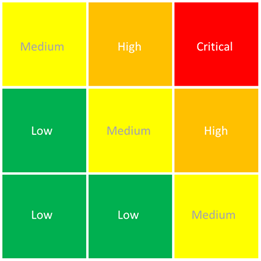
A risk matrix chart, as the name suggests, is used for performing risk analysis. Typically, we combine the Likelihood and Impact ratings of an event to arrive upon a risk score, which aids in deciding on what action to take in view of the overall risk. For the purpose of this post, I have just got 3 levels for the Impact and Likelihood (and this can be increased/decreased as per your requirement). For both Likelihood and Impact, a rating of 1 means Low, 2 means Medium and 3 means High. Now I have categorized the risk score into Low, Medium, High & Critical and would like to plot my events as a scatter chart against this. For that, follow the steps below:-
1) Create an image with the required risk scores in excel / PowerPoint / Paint. I came up with the following image.
This will server as the background image of our scatter chart. Add this image to the report.
2) Create a report with the required data sources and dataset. In this case, I have just made a sample dataset
SELECT 'Project A' AS Project, 0.5 AS Likelihood, 0.8 AS ImpactUNION ALL
SELECT 'Project B' AS Project, 0.8 AS Likelihood, 1.3 AS Impact
UNION ALL
SELECT 'Project C' AS Project, 0.9 AS Likelihood, 2.5 AS Impact
UNION ALL
SELECT 'Project D' AS Project, 1.4 AS Likelihood, 0.9 AS Impact
UNION ALL
SELECT 'Project E' AS Project, 1.5 AS Likelihood, 1.5 AS Impact
UNION ALL
SELECT 'Project F' AS Project, 1.2 AS Likelihood, 2.9 AS Impact
UNION ALL
SELECT 'Project G' AS Project, 2.1 AS Likelihood, 0.2 AS Impact
UNION ALL
SELECT 'Project H' AS Project, 2.4 AS Likelihood, 1.4 AS Impact
UNION ALL
SELECT 'Project I' AS Project, 2.7 AS Likelihood, 2.9 AS Impact
UNION ALL
SELECT 'Project J' AS Project, 1.6 AS Likelihood, 1.2 AS Impact
UNION ALL
SELECT 'Project K' AS Project, 2.2 AS Likelihood, 2.2 AS Impact
UNION ALL
SELECT 'Project L' AS Project, 1.1 AS Likelihood, 0.7 AS Impact
3) Go to the toolbox and drag and drop a chart item into the report body. Select the chart type as Scatter chart and click on OK.
4) Drag and drop Likelihood from the dataset fields list into the Values and then select Impact as the X Value in the chart. Also drop Project field into the Category Group of the chart.
5) Change the Axis titles to Likelihood and Impact for the Y and X axis respectively. Then go to both of the axis properties, and set the minimum as 0, maximum as 3 and Interval as 1.
6) Now click on the chart area and add the RiskMatrix image as the background image.

You might also want to hide the major gridlines for the horizontal and vertical axis.

7) Now with a bit of cosmetic changes to your marker colours, we arrive upon the end result. It is a good practice to enable the tooltips on the points, so that we can just hover our mouse to find out the project names.

The beauty of this approach is that it can be extended to a lot of other scenarios. For eg, I remember using this approach to answer a scatter chart with four quadrants question in the MSDN forum.


No comments:
Post a Comment