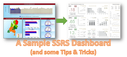
The other day, I was browsing for some sample SSRS dashboards and one of the top images that came up made me cringe. You might wonder what could be so bad in a dashboard as to make me cringe. Well, apart from the factor that the dashboard was openly flouting all the best practices for visualizations and that it would have misled countless people in virtue of being one of the top five images for the search term – ‘SSRS Dashboard’, it was made by ME. To be precise, this dashboard was made by me around 3.5 years back, a time when I believed more in ‘eye-candy’ rather than effective visualizations. That was when I felt that I owed a proper SSRS dashboard to the community.
First of all, let me start by saying that this dashboard was inspired (a polite way of saying – a complete rip-off  ) from this Dundas Dashboard example. Personally, I felt that this was a very good dashboard example and I decided to reproduce it in SSRS. The result is given below:-
Let me tell you some of the things that I like in this dashboard:-
1) The colours are carefully chosen. Note how the dashboard is not a kaleidoscopic combination of different colours like it's predecessor. Light tones of grey are used to depict the axis as well as the gridlines, while the charts are more darker which gives them more attention.Also, in spite of having 4X times more information than the previous dashboard, the new one doesn't look crowded (thanks to the right choice of colours)
2) The dashboard focuses on the three main KPIs but also has an executive summary on the right. I also like the way each line represents a story for that KPI.
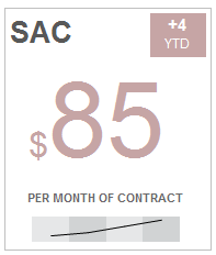
3) I particularly like the KPI boxes on the left. Each box has a current value (which is highlighted by the size), difference from YTD (which is the small box on the top right), a sparkline on the bottom as well as conditional formatting to show whether the KPI is above or below the target. I think it gives a sexy eye-candy sort of feel to the dashboard without bending the visualization best practices. Also, I prefer the faded red and green colours to the normal traffic light red and green colours that we see in usual dashboards.
4) The labels are all formatted appropriately (for eg, 3M instead of 3,000,000). This ensures that we don't waste a lot of space for labels.
With that said, let me go ahead and show you some of the tips and tricks I employed for making this dashboard:-
I) Alternating Background for the sparkline
You can see the above sparkline (which is for the four quarters) has an alternating background for the four quarters. By default, you can have alternating colours in SSRS chart background if you set the background color of the chart area to a color (say light grey) and the InterlacedColor property of the X axis to another color (say dark grey). Now the problem is that the line charts will start at the meeting point of the two colours (like shown below) instead of at the centre.
One of the ways you can get this done is by adding 4 striplines to the X-axis. For the first and third stripline, ensure that the BackgroundColor is the same (lets say light grey) and the second and fourth should have the same BackgroundColor (which is dark grey). All the striplines should have a Stripwidth of 1. The IntervalOffset property should be 0.5, 1.5, 2.5, 3.5 respectively for the four striplines.
Click on the Y axis and press the delete button to remove it. For the X axis, click on it and set the LineStyle property to None, Major TickMarks-->LineStyle to None and HideLabels to True. This will give us the required result below. For use in the dashboard, remove the chart border also.
II) Pretty KPI boxes
The pretty KPI boxes are just a combination of textboxes and the sparkline we made above. This is how it actually looks in design mode
Right now, I have hardcoded most of the stuff. But you can change it as required. For eg, to get the conditional formatting, you can write a simple expression in the Color property of the textbox. The only other thing is to have different font sizes / font styles for the $ and numeric value. To demonstrate that, I pull in a textbox and type $ in it. After that, I drag and drop a field from my dataset (SAC) to the textbox.
Now I can individually select $ and give it a different font style / font size and also do the same for SAC (whose expression I modified to =Sum(Fields!SAC.Value, "G1_B1") from =Fields!SAC.Value)
III) Formatting the labels
To format your labels in thousandss, you can use the format – 0,’K’
Similarly, if you want to format in millions, you can use - 0,,’M’. Note that you are just increasing a comma.
IV) Correlated column charts
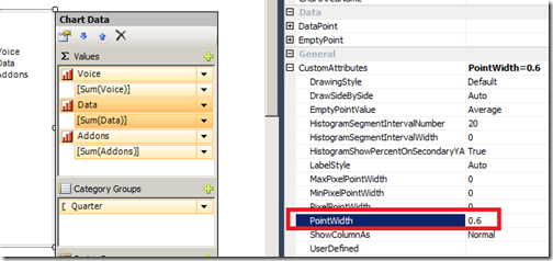
For this, add a normal column chart with 3 measures.
Now change the PointWidth property of the second measure to 0.6 and third measure to 0.3.
Now right click on the Chart Area, and click on Properties. Check the ‘Enable 3D option and set the rotation, inclination and wall thickness to 0.
After that, set the BackgroundColor property of the chart area to No Color. Now you should have the required correlated column chart.
Well, there are a few more tips in the dashboard that I made (even though I have hardcoded a LOT of stuff, since this was just a demo) and if you want, you can download the rdl file of this report from here. Hopefully, I have redeemed myself by creating a better dashboard than the original one! 


No comments:
Post a Comment